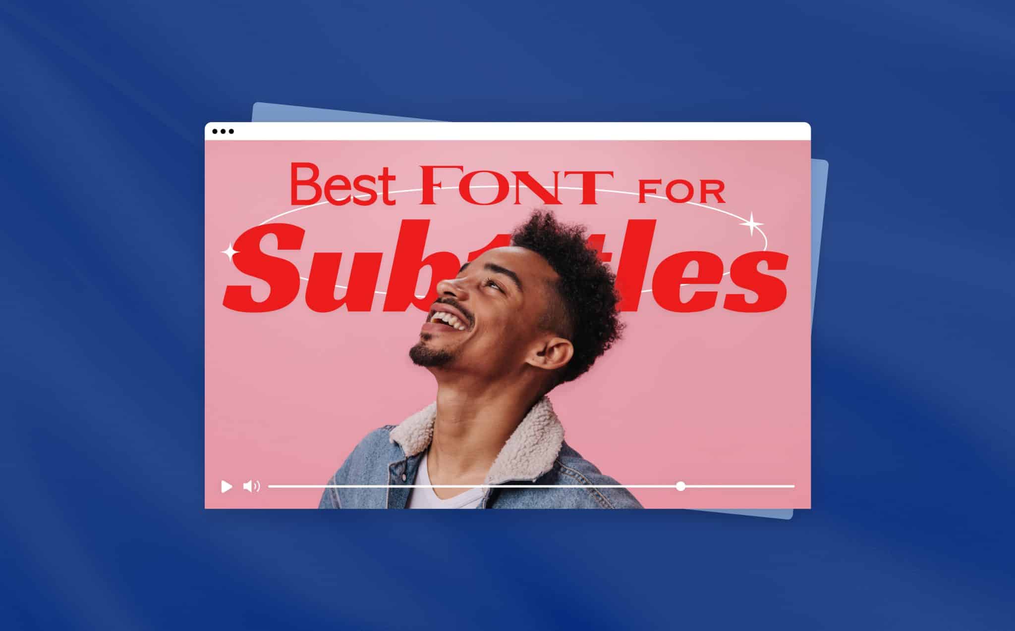
Best Subtitle Fonts to Use For Video Editing in 2024

Subtitles make videos more accessible to a wider audience. They are used today for viewers of visual media to understand the content even if they don’t have the audio on, don’t understand the speakers’ language, or are hearing impaired.
Even though subtitles are common and familiar – you’ve probably read them without even knowing they’re there. It isn’t hard to understand what exactly goes into creating high-quality subtitles. Subtitles allow viewers to read and understand what is being said even without the sound, but using the right subtitle font is what ensures that viewers can see and comprehend your video’s text clearly. Indeed, subtitles are not just about the textual version of the spoken audio. When adding subtitles to video, considering the easiest font to read is key to creating a rich video experience. If you’re still on the starting blocks and looking for a quick and easy video maker, click here.
So what exactly are subtitles, and why do high-quality subtitles matter in video? We’re about to show you!
Let’s get to it!
What Exactly is Subtitling?
Subtitling is the procedure of adding text to videos that helps viewers understand the video content, or close captioning. They are used for the hearing impaired and, in many cases, are required by law in government and work settings. However, subtitles are becoming popular on YouTube and internet videos. With many viewers engaging with videos on mute – when it comes to social media videos, adding subtitles to our videos serves a much larger audience today.
Typically subtitles are displayed on one or two lines of text per frame. They will generally show summarized versions of the spoken content in the video or media or video highlights. However, they can also be direct translations of the audio content. Often the terms are used interchangeably. For example, YouTube uses the terms synonymously by referring to closed captioning or YouTube subtitles with the same button for much of its content.
Excellent subtitles that contain the easiest font to read will enable the audience to read and understand the visual content while watching comfortably.
Subtitle Font Tips
Conceptually, subtitling a video seems simple enough – just type text, right? However, in practice, understanding some basics can help with engagement by assisting you to correctly use subtitles and make your video clearly understood, even with muted sound. Here are some tips on using the right subtitle font.
Pay Attention to Placement
In today’s digital landscape, many viewers are watching video content on mute. They are also watching it on their smartphone screens. Correctly placing subtitles in the frame is therefore crucial. Poorly placed subtitles can adversely impact subtitle font visibility, readability, and ultimately accessibility.
If a viewer can’t understand the text because it’s obscured, not legible, or blends into the backdrop of the visual elements in the video, the chances of a viewer watching the entire video is slim.

Here are some common examples of subtitling placement issues that can cause a problem with visual clarity.
- Subtitles can obscure video information, including speaker names, locations, dates, or critical information shown on the screen.
- Covering up or obscuring sports scores.
- Clashing with the company logo or watermark.
- Subtitles that don’t take into consideration the video aspect ratio.
If your video isn’t the right size, that can also make subtitle placement difficult – use a video cropper to instantly crop your video for each social platform.
Maximize Readability
Subtitle readability is directly connected to legibility. However, readability focuses more on how easily the viewer can read through the text instead of differentiating it from the image in the background.
Among the more critical things when it comes to readability is timing. A viewer must have sufficient time to read the subtitle text in the time the text is visible on screen before fading out or transitioning to the next video frame.
If a viewer can’t follow the textual content, they probably won’t engage with your video. So, in addition to font readability, using the proper character limits and time requirements for placing text helps accessibility.
So how do we know what makes fonts readable?
Using standardized fonts is essential because standardized fonts are the easiest fonts to read. Most people are used to reading standard block fonts, like Arial or Verdana. However, non-standard fonts can take longer to read. Even if they are pleasing aesthetically – viewers must mentally distinguish the aesthetic aspects of the font from actual letters.
Here is an example of the misuse of an overly creative non-standard font and how using the standardized font is much easier to read.
Clarity is Key
Other things to consider are character width, character spacing, size, and title case. For example, because of their width, some fonts can take up much more allocated space than others. This can also limit the amount of text you can use for a single frame.
It is also essential to be aware of your font size. The standard font size for subtitling is around 22 points but is flexible with each font used. Just make sure the subtitle text is not so large that it is the primary focus of the frame.
Additionally, it’s essential to be aware of your capitalization and how it looks with your chosen font. For example, you need to check that the capital “I” and lower-case “i” are distinct and used correctly. While these aspects often go unnoticed in other text forms, they make a significant impact on subtitles.
Here is an example of text used with both extra-wide fonts and how the slimmer font makes the text more readable.

Subtitling Font Tricks for Readability
We discussed the importance of readable subtitles above, but let’s dive a deep deeper. There are several fonts hacks that will help you achieve clear, more legible subtitles for your video. Many of these subtitling tricks can be done in just about any video maker or editing program.
Bold the Subtitle Text
One of the most straightforward changes you can make to make subtitle text more legible is by making the subtitle font (in this case, Verdana) bold.
Change the Color of Your Text
White is a standard color in videos for subtitles, so it is no surprise that lightly colored backgrounds can make white subtitles hard to read. Often changing your subtitle color to yellow or even black will do the trick. Take a look at this example.
Add a Drop Shadow
Sometimes, when many visual elements in the background can make it difficult to see the subtitles clearly, adding a drop shadow on your subtitle text is a great way to allow your text to stand out from the background subtly.
Top 8 Font for Subtitles and Captions to Make Great Videos
There are many different choices when it comes to font styles. Let’s take a look at some of the most popular and their best-case uses.
Arial
The Ariel font is a modern sans serif-style font designed by Robin Nicholas and Patricia Saunders in 1982. Arial grew in popularity because it is Microsoft’s core font and also because its design is simple. Ariel quickly became the most accessible sans serif font available on computers in the ’80s and is one of the most common standard fonts available today.
Ariel is one of the easiest fonts to read and is regarded as the best subtitle font for captions and subtitles and is the standard for closed captioning fonts.
Helvetica
Helvetica is a widely used sans-serif font that was developed in 1957 by Max Miedinger & Eduard Hoffmann. Miedinger and Hoffmann wanted to make a neutral font that had clarity that could be widely used.
Helvetica is used for logo and web design. It’s popular among designers because of its unique look and feel, and versatility. Also, the classic yellow subtitle that you often see happens to be the Helvetica Medium Italic font. The yellow subtitle is often used for movies because it has the highest refractive index, making it seen easily from a distance.
Not too long ago, Helvetica actually got a facelift. Monotype (a publicly-traded type foundry and technology company) decided a few years ago that Helvetica needed updating to a more modern look.
Now, Helvetica also has in its font family what is known as Helvetica Now. The new font updated each of Helvetica’s 40,000 characters to rise to the use demands of the 21st century with a more legible design for viewing on tiny screens, like the Apple Watch.
Roboto
Roboto is a sans-serif font developed by Google for its mobile operating system — Android. It was released in 2011.
Christian Robertson designed the Roboto font, and it offers a distinct, widely recognized kind of geometric structure. The main goal for developing this font was to allow the letters to look equally good across all mobile devices and happens to be the font of choice for closed captions on YouTube.
Verdana
Matthew Carter designed the Verdana font for the Microsoft Corporation. It is a sans-serif font, and after it was developed, there was input for the final work by Thomas Rickner and Monotype.
Verdana was designed so it’s readable at small sizes on low-resolution screens and is considered the “professional font.” Additionally, Microsoft added Verdana to the Windows operating system as well as Mac.
Verdana is widely used for CVs and cover letters for employment applications but is primarily known for how clear it looks in very small print or small screens. It is also considered one of the easiest fonts to read.
Times New Roman
Times New Roman has been around since 1931 and is a serif font created by Stanley Morison in collaboration with Victor Lardent. The font was commissioned by the British newspaper in answer to the demands of newspaper printing presses, which began using faster printing machines and cheaper paper.
It is one of the most popular fonts today and is readily installed on desktop computers. In addition, it is a staple in graphic design software due to its readable and versatile visual nature.
Tahoma
Tahoma is a sans-serif font that evolved from a computer “bitmap” by Matthew Carter for Microsoft. It was distributed as a standard font in the release of Windows 95 OS. The font is popularly used in several Windows applications to date. Additionally, Tahoma was also used for Skype and Sega’s Dreamcast promotional material.
A fun fact about the Tahoma font is that it was named after the Native American reference to a prominent feature of the landscape around the Seattle metropolitan area known as Mount Rainier. The Native Americans called Mount Rainer Mount Tahoma.
Calibri
Calibri is a sans-serif font released in 2007 with Microsoft Office 2007 and Windows Vista. Albeit, it was actually designed by Lucas de Groot in 2002–2004. Calibri was used to replace Times New Roman as the default font in Microsoft’s Word, as well as the default Ariel font in Excel, Outlook, PowerPoint, and WordPad.
However, Microsoft has recently decided to change its default font, which means Calibri is going bye-bye. Not only are they replacing Calibri, but in addition, Microsoft is offering five new possible default fonts that people can try and then vote for.
Open Sans
Open Sans is an open-source sans-serif font, commissioned by Google and released in 2011. It was designed by Steve Matteson and is a wider design that is based on the fonts created for Android mobile devices. An interesting fact about Open Sans is due to its popularity, in March of 2021, the font family was updated to include Hebrew characters.
Open Sans is considered a true italic font and is commonly used in web design and can be found on Google’s web pages and different online advertisements.
More Things To Keep in Mind When Formatting Font for Subtitles
Correctly formatting your subtitles is vital for optimizing the engagement of your video. A good subtitle should be clear and legible but also not draw too much attention away from the content of the video.
Here are a few best practices to keep in mind when formatting your subtitles.
Color Scheme
Like with any design issue you might face in creating a video, making sure your color scheme is consistent throughout your video is also very important. It’s not visually appealing to the reader if your colors clash so dramatically that it’s hard on the eyes.
Stay away from highly contrasting colors or colors that clash because they might be hard on the readers’ eyes. Additionally, for small businesses using video for promotion or advertising – it’s always good to make sure, if possible, that your color scheme is in alignment with your brand.
Here is an example of what might be considered clashing colors.
Screen Resolution
When choosing your subtitle fonts, another critical aspect to consider is where your target audience is viewing your video. If you know that most of the content is being watched on mobile devices, choosing a font like Open Sans or Verdana might be good.
Licensing of Fonts
When using different fonts, it is important to understand the difference between licensed and non-licensed fonts. The licensing laws can be confusing, and although many free fonts allow unrestricted use, “free” fonts can often be commercial fonts that are illegally copied.
Most commercial design programs come with licensed font usage, like Microsoft Word fonts. This means you can use the fonts commercially if you have a licensed version of Microsoft windows.
It is important to be cautious and ensure the fonts you are using come from a trusted source and understand the usage rights.
What is the Difference Between Captions, Closed Caption and Subtitles?
Captions and subtitles are different, but they often overlap. While both display text on your screen, the purpose for each is quite different.
Captions
The literal definition of captions is a “title or brief explanation appended to the media.” This basically means the title or brief explanations of the video at the bottom of the screen. However, captions specifically can either be open or closed.
Closed Captions
Closed captions can be turned on or off with the click of a button, whereas open captions are a part of the video itself, are often referred to as subtitles, and cannot be turned off. For example, you can find YouTube subtitles or closed captioning services on their platform for most of their videos and can turn them on or off.
Subtitles
In comparison to captions, subtitles are essentially captions displayed at the bottom of a video, movie, or television screen. They provide a translation or transcription of the dialogue or narrative.
However, it is important to note that often the terms subtitle and captions are used interchangeably. So, for instance, you can add subtitles to your video to highlight the main points of your message in your native language, and even though it’s not a language translation, it is still considered subtitling or adding captions.
What Are Serif and Sans-serif Fonts?
Many popular fonts are divided into two categories – serif or sans-serif. Initially, it may not seem there is much difference, but there are key differences.
If you just glance at the two fonts, it may not seem like there is much of a contrast between sans-serif and serif letters, but when you look closer, you can see key differences between the two styles.
Serif Fonts
The term “serif” refers to the small stroke found at the end of the vertical or horizontal strokes of the letters. A serif is a decorative stroke that is placed on the end of a letter’s stem (sometimes also called the “feet”). “Serif fonts” refers to font styles that have serifs (those extra strokes). In some cases, a serif can aid in the readability of the font. Serif fonts are quite popular and have been around for a while. Times Roman is one example of a serif font.
Sans Serif Fonts
Fonts without serifs are known as Sans-serif fonts. Sans-serif fonts are popular due to their clarity and legibility from a distance in advertising. Because sans-serif fonts were often used in commercial printing, many early designs didn’t feature lower-case letters.
Sans-serif fonts have become popular today for the display of text on computer screens and lower resolution displays. These fonts are used just in case the screen resolution that a video is playing on cannot display the finer visual details, and the serifs (extra stoke) may disappear or appear too prominent.
Take a look at this example to better understand the difference. The first letter is a Sans-serif (Verdana) font, whereas the second is a serif font (Times New Roman).
How to Add Subtitles to Video with Promo.com
Promo’s video maker is a really great solution for simplifying the subtitling process. It grants access to an array of great royalty-free fonts. Promo’s subtitle editor takes the guesswork out of sizing issues with the flexibility of choosing the text frame sizes, unique font customization, as well all allowing for different placement of your subtitles in your video. Here’s how.
Upload Your Video to Promo.com
Upload the video you want to caption or subtitle. You can also create a video using our professionally designed video templates or premium clips.
Add Subtitles and Customize
After uploading your video in Promo’s video maker, click the round pink plus sign to the left of the timeline. Select “Add Caption” from the dropdown menu. When the window on the footage pops up, edit & design your subtitles in the frame.
You can easily customize your caption fonts or subtitle fonts to reflect your brand’s voice. Our subtitle editor offers hundreds of fonts for editing. There are also many color options, and more. Promo also offers dozens of animated text presets. Look out for our subtitle text-style animations when you need to creatively emphasize your text for readability.
Preview & Publish
After you’ve added and precisely placed and designed your subtitles with creative text and colors, you can click on Save & Preview to see your work and publish or download.
FAQ’s
What Font Does Netflix Use for Subtitles?
The primary subtitle font used by Netflix is known as Consolas. Netflix subtitles is a monospaced (fixed-equal spaced) font. Every character in the subtitle fint has the same width, just like the old typewriters.
What Does Closed Caption Mean?
Closed captions are the text version of the dialogue or spoken words and any other key audio elements in a movie. Closed captions can be turned on or off at will and are usually provided by closed caption services for the hearing impaired.
Why Add Subtitles?
Captioning your videos can have a significant effect on how well your videos engage. This is because not everyone can use their audio when watching videos, among other reasons. Not only that, but over 100 empirical studies show that captioning a video improves the overall comprehension, attention, and memory of the video.
Adding subtitles to a video helps with social media engagement – Facebook said that adding captions to your video can boost your viewing time up to 12%.
Adding subtitles can help your SEO efforts. Google indexes captions that you have added to your videos. This can make a huge difference in how your rank online.
AI and the Future of Subtitle Typography
In the meticulous craft of subtitle typography, AI is not just a tool for efficiency; it’s becoming a collaborator in the creative process. The integration of AI with tools like Kapwing’s AI Subtitle Generator is a testament to this trend, where the once labor-intensive task of matching text to speech is now a streamlined, automated process. This shift is part of a broader movement, as highlighted by Poynter, where AI’s role in content creation is expanding beyond routine tasks to areas requiring a nuanced understanding of human creativity and expression. Similarly, PwC’s examination of content’s future in the AI age reflects on the evolving partnership between human ingenuity and AI’s capabilities. This collaboration is paving the way for subtitles that are not only precise but also tailored to the video’s visual narrative, ensuring that the chosen fonts enhance readability and contribute to the storytelling.
As AI continues to advance, it is poised to refine the subtleties of subtitle design further, promising a future where font selection is not merely a matter of style but a sophisticated decision that encompasses accessibility, engagement, and the harmonious integration of text into the moving image. This evolution in subtitle creation is a clear indicator of the transformative impact AI is expected to have on all facets of content creation, ensuring that subtitles serve as an integral part of the viewing experience for audiences everywhere.
In Closing
Adding subtitles is definitely worth your time and isn’t that difficult with the right tools. Whether you create a small business promotional video or a video social media post, learning how to add text to TikTok using the right font for subtitling your video will go a long way. Subtitles also come in handy when creating ads – use our Video Ad Maker to effectively place your subtitles and help boost your conversion rates. If you’re putting together a music video or simply want to add lyrics to a song featured in your video – try our easy-to-use lyric video maker.
It might not seem worth the time to think about fonts and font design. But by now, you know it does make a difference to optimize your content. Using a good online subtitle editor will also streamline the process, making it even easier to find and stylize the perfect font for your video in 2022.


