Video Landing Pages: The Complete Guide
Text and image-based landing pages are so 2018…
The future and the present is video landing pages! Today, online video consumption is up across the board, landing pages with videos get more conversions, and video marketing has never been more accessible in human history. Now is the perfect time to start incorporating video into your landing pages.
But hold on a minute—if something is worth doing, it’s worth doing right. Embedding your favorite cat video onto a landing page isn’t going to suddenly boost your conversion rate. There is an art and a science to increasing your conversion rate by using video content on your landing pages, and that’s exactly what we’re going to cover today.
What is a video landing page?
A landing page is a single web page with a single goal—get the visitor to take the specific action found on that page, usually filling out a form. Landing pages typically do not have navigation to other parts of the website, nor anything to distract from the offer. In essence, a landing page consists of a headline, a description of the offer, a graphic, and a form.
Video landing pages are just that, but rather than text and graphics, a video is what drives action.
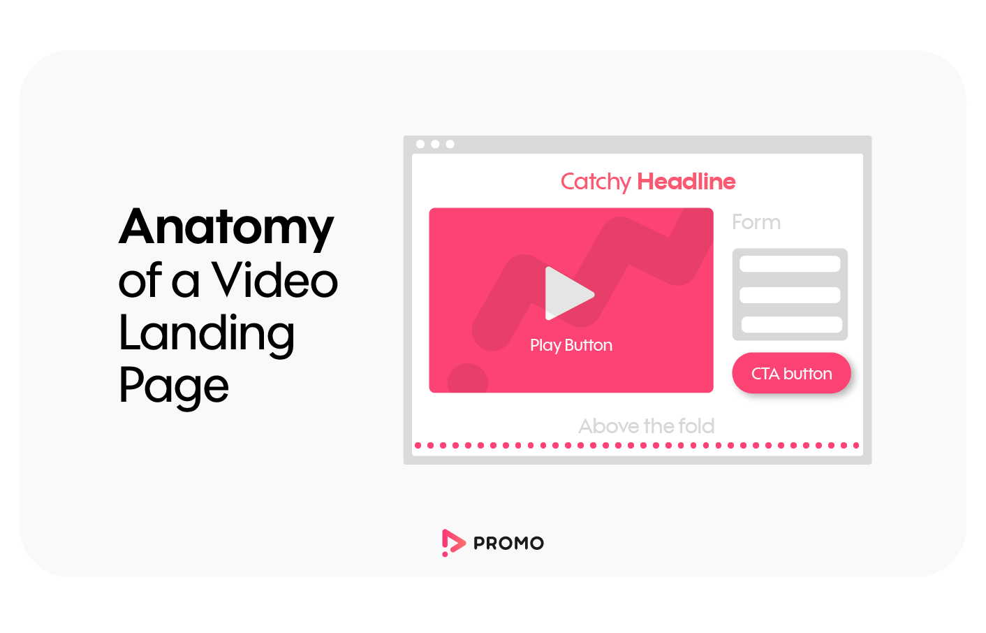
From a technical perspective, that’s the only difference between a regular ol’ landing page and a video landing page. But from a business and marketing perspective, there’s quite a bit of difference. Marketers will go to great lengths to increase the conversion rate of their landing pages through a process called A/B testing; from swapping out an image, headline, or description, to changing the color of the “Submit” button. Each percentage point gained in the overall conversion rate can have a drastic effect on lead volume, and therefore business.
Using a video on your landing page, however, might be the #1 thing you can do to increase your conversion rate. In a case study from Klientboost, simply adding an explainer video to a financial services landing page increased conversions by 60%.
From a consumer perspective, videos are much better at capturing our attention than a wall of text. When executed correctly, the ‘hook’ of a video arouses our curiosity to the point where we just have to stick around to see how the next bit of information pays it off.
Video also caters to shorter digital attention spans, as well as our propensity to multitask while online. When reading, you can’t do much else. While watching a video, however, you can glance at the headline on the page or the authority badges.
A video landing page generates trust and authority quickly, communicates your offer in a friendly way, and it accesses people’s innate need to connect with others and activates the feel-good parts of the brain when people connect face-to-face.
Lastly, videos also offer a way to explain things in a way you just can’t do with graphics or text. It’s easy to show a ‘before and after’ image, but much more difficult to explain what changed and how you arrived at the solution without video.
Pro-tip: You can easily create custom landing pages and optimize them for conversion with Unbounce. The platform allows you to create your own landing page without any coding or development skills.
Examples of video landing pages
This first one is Wistia, a video hosting and software platform for businesses. We’ll come back to them a bit later but for now, take a look at this stellar video landing page.
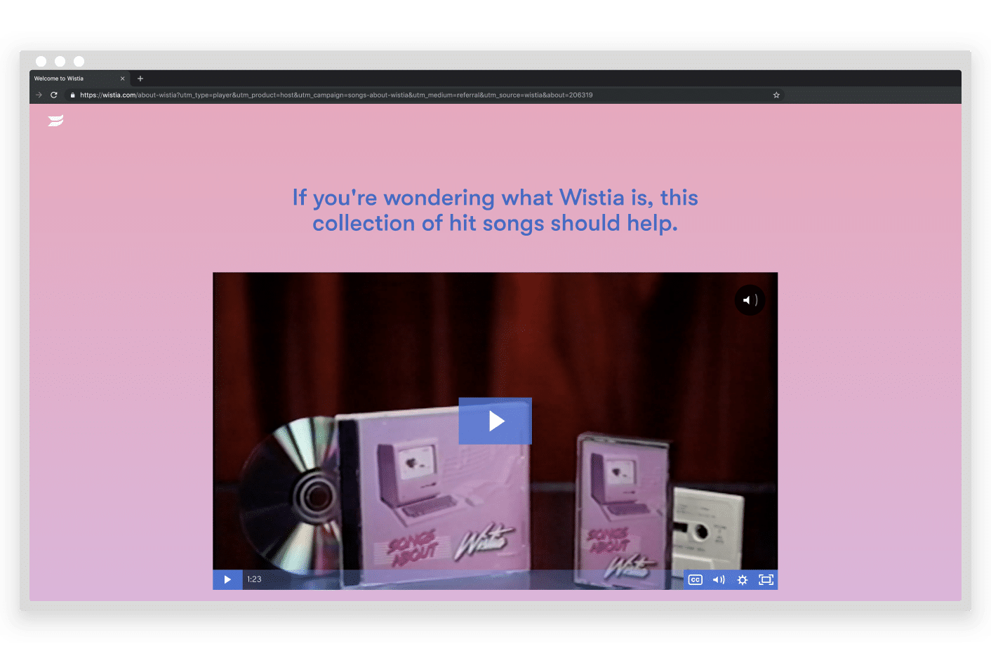
How much fun is that video? Not only is it amusing and joyous, but it taps into a huge mental trigger that instantly creates a relationship with the viewer—nostalgia. Not to mention all the benefits of their product and service is communicated clearly but in a very fun and novel way, you won’t soon forget.
Wistia breaks the mold a little bit here by not including a lead conversion form, but there’s a pretty good reason for it. Since Wistia is a software company that specifically designs video players with advanced features for marketers, it aligns with their brand to demonstrate the power of a message driven solely through video. Note the lack of description anywhere on this page; just enjoy the video and click the button to learn more.
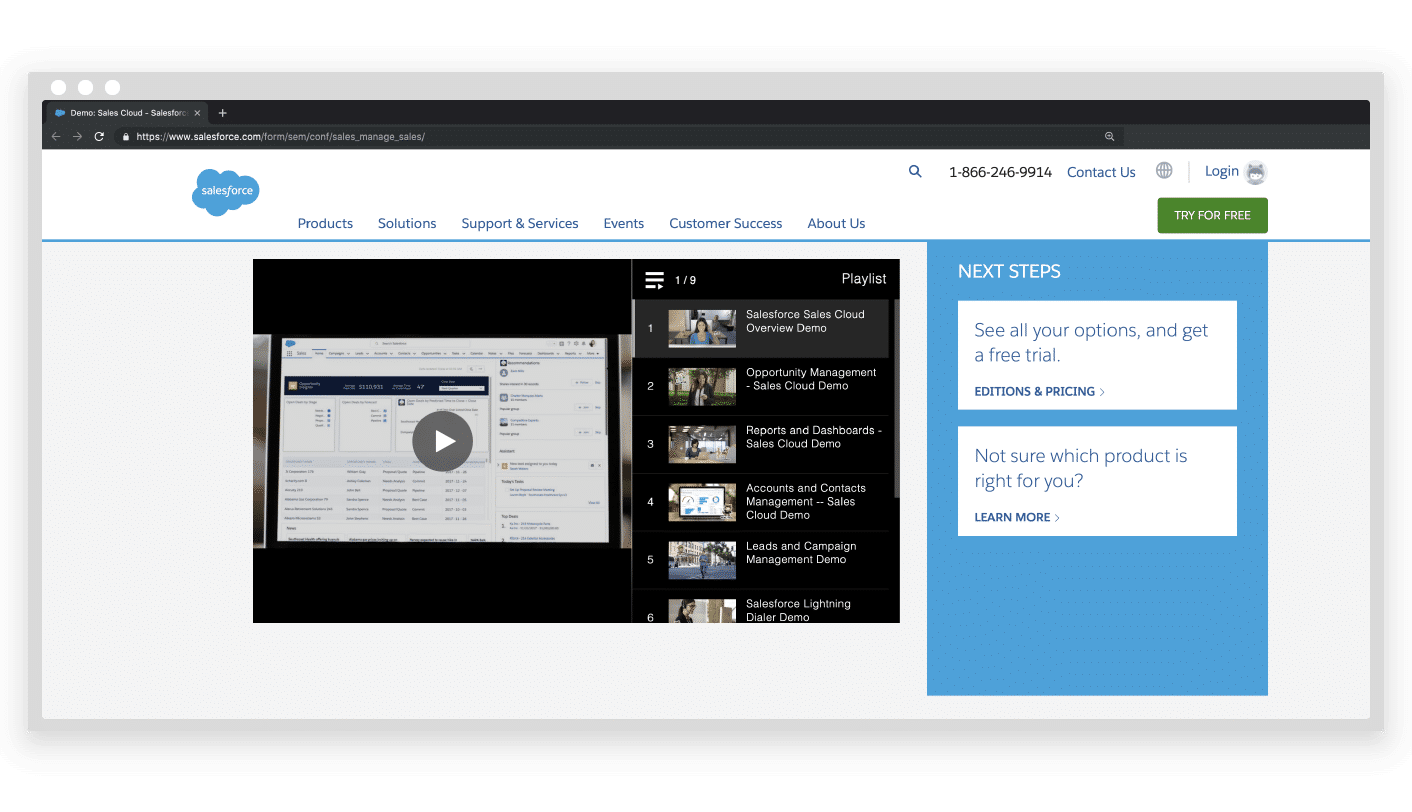
This one from Salesforce hits all the right buttons—it’s informative but light, simple yet elegant, shows you what the features are rather than telling you what they are. It builds trust, authority and deeply understands its market—sales professionals.
What are the benefits of video landing pages?
In short, the benefits of using a video landing page are:
- Increased conversion rate (see section below)
- More accessible for people who would rather watch than read
- More time on page
- Increased trust
If you got to “increased conversion rate” and stopped reading, we don’t blame you, and that’s why we broke that point out into its own section. But it’s really important to understand that the other benefits listed are all rolling up to increased conversion rates.
Making your company or products accessible is the first step. If we feel something is over our head, too complicated, not relevant—we’re gone. This happens so fast, literally seconds, and video gives you a chance to connect with a higher percentage of people simply because there is a growing population that would rather watch than read. And it’s not actual laziness driving this behavior:
59% of executives said if both text and video are available, they are more likely to choose the video option. (WordStream)
Additionally, videos are known to increase dwell time (the amount of time somebody lingers on a page) on website pages. The longer a person stays on your page, the more time you have for them to absorb your message and brand, which is something all companies should aim for. A video on your landing page has the ability to inspire awe, laughter, joy, or amusement, which also happens to be the top 4 emotions that make people click and stay on your page longer.
Does video increase conversion rate?
Absolutely.
Ty Lingley from Unbounce says that using video on landing pages can increase conversion by 80%.
And it’s really not that hard to see why adding a video to your landing pages can help you achieve huge increases in conversions. First, it matches consumer behavior we’ve all come to embrace as both marketers and shoppers. There is an increasing preference for people to watch instead of read.
Additionally, landing page videos give you a completely different and captivating way to explain your offer that text and/or static images can’t. For example:
- Need a boost of energy for your offer? Add an upbeat soundtrack to the beginning.
- Is your offer complex? Use a whiteboard sketch animation to unpack the details.
- Want to add emphasis? Add text on the screen that explains the benefit succinctly.
By virtue of the medium alone, video greatly expands the capability of how you’re able to deliver your message.
Yet another massively important (but often overlooked) benefit of landing page videos is time. Consider the difference between these two scenarios:
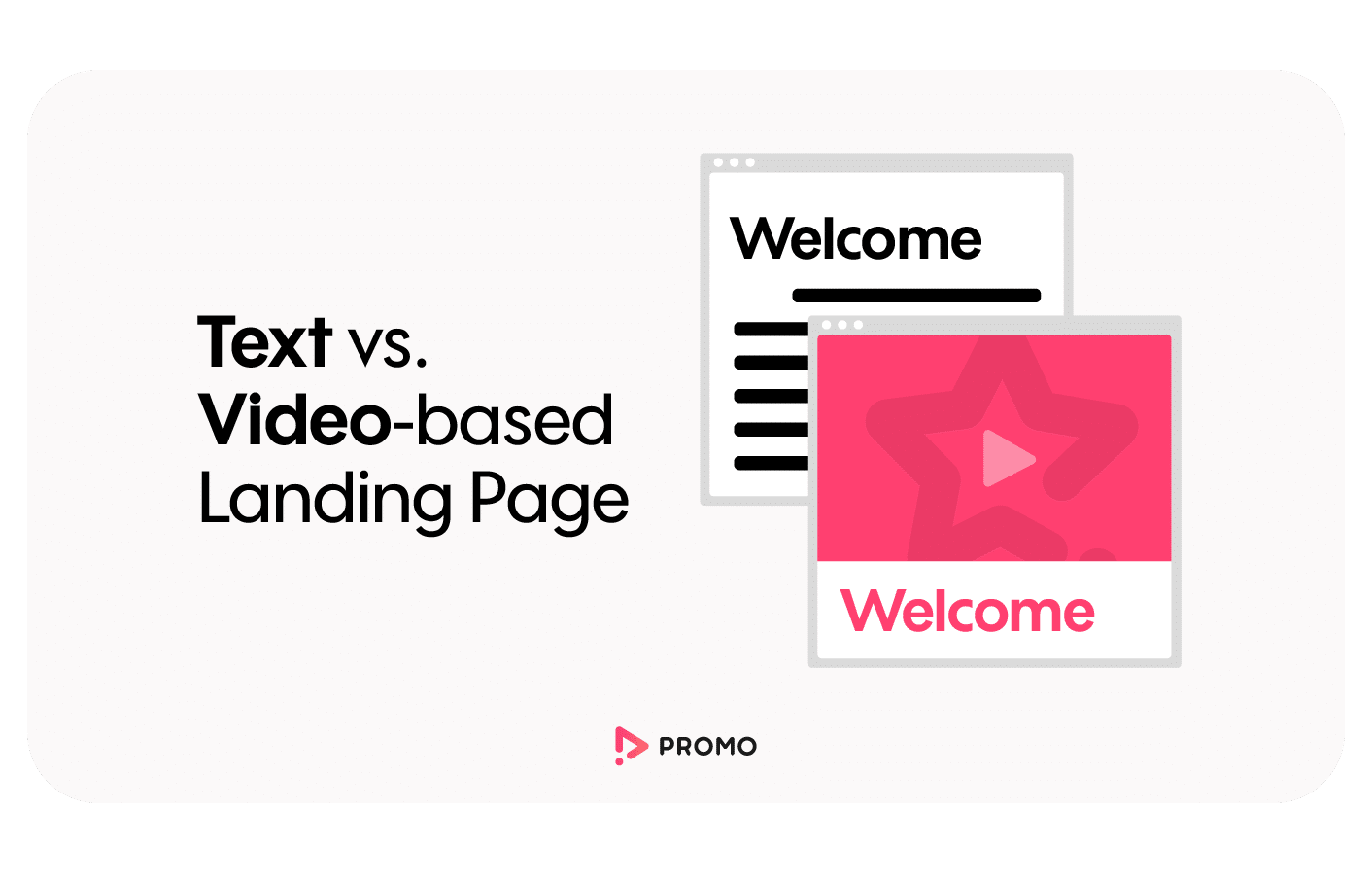
Text-based landing page: We see a bunch of text and are hesitant to invest the time to read it. Or, perhaps the headline wasn’t perfectly worded and we decide the offer isn’t relevant to us. Either way, we only spend a few seconds on the landing page before clicking the back button.
Video-based landing page: We see there’s a video, which either auto-plays or we click play. As the video starts and we wait for the attention grabber, we glance around the page, soaking in the company’s branding. Bonus points if there is social proof or authority badges included on the page. If the video is done properly, our attention is hooked for at least another 15 to 30 seconds, which is precious time to help convince us that the offer on the landing page is right for us.
See the difference? The video not only helps you explain your offer in a more creative, compelling, or clear fashion, it’s also helping all of the elements of your page (headline, description, social proof, etc.) work harder as well.
That, friends, is what we in the marketing industry call synergy. Yes, it’s a business cliché but it’s 100% accurate in this case.
How to create an effective video for my landing page
So while videos on landing pages do increase conversions, and we highly recommend using them whenever you can, it’s not that you can just add a video and **poof** your conversion rate skyrockets. The video content, the length, the call-to-action, and a ton of other aspects at the execution level of the video can be the difference between marginal gains in conversions and absolutely game-changing increases.
To learn more about what you can do in terms of video production, strategy, and execution to increase conversions with video landing pages, read on.
How long should a landing page video be?
If you’ve read any of our other thought leadership pieces on our blog, you’ve likely realized that these types of questions are rarely black and white—there is nuance and context that we need to take into account to provide a useful answer.
We can’t in good faith tell you that a 30-second video will outperform a 2-minute video. What we can do, however, is provide some best practices around video length, cite some recent research, and also give you the tools to formulate your own content requirements to help you determine the perfect length for your video.
Let’s start with the golden rule of marketing video length:
There’s a clear trend in consumer preference, and therefore effectiveness, for shorter marketing videos. According to Vidyard’s 2019 Video In Business Benchmark report, the average video length in 2018 was 4.07 minutes long, 33% shorter than 2017’s 6.07 minutes. Additionally, the same report found that 73% are less than two minutes long. When it comes to writing your landing page video script and producing content, just remember that a two-minute video is preferable to a four-minute video.
However, it’s important to take into account the context of your offer. The simpler the offer, the shorter the video. More complex offers, or high-ticket offers, are generally going to require more length to get your point across. Step into the mind of your potential lead for a moment to understand the difference.
For example: Let’s say you’re using a landing page to sell a $50 shirt. All the consumer really needs to know to make the decision is:
- Does it fit my style?
- What fabric is it made from?
- What is the shipping/return policy?
If you’ve covered those three points in your video, you can probably do it in under a minute, and with plenty of style to boot. There isn’t much need for in-depth logic, customer testimonials, or a detailed walkthrough of your offering, etc.
Now consider a more complex offer—a one-hour live demonstration of business software that will likely cost upwards of $10,000 and involve many people at your company. Sure, it’s technically free to demo the software, but it’s an hour of your time and a commitment to follow this path of research, which is why software demo landing pages are not 100%, even if they’re free!
Look at the questions on your prospects mind in this common B2B software scenario:
- Why do I care about this/what problem does this solve?
- What happens if I do nothing?
- What is our competition doing?
- What do I need to know?
- What are the best practices?
- What are my options?
- How do I get everyone to agree?
If you choose to address all those points—and you should if you care about your conversion rate—that’s a lot to cover in a video. You might need a talking head to articulate the problem, a brief software demo to illustrate a key feature and a short testimonial from a happy client. No way you’re cramming all that into a video under two minutes, given all the complexity. In general, 52% of viewers watch a video all the way through. 68% of viewers will watch until the end if the video is shorter than 60 seconds, but only 25% will finish the video if it’s more than 20 minutes. (Vidyard)
Bottom line: The more complex (and expensive) your offer is, the longer your landing page video should be while still following the golden rule of video marketing length.
Video landing page structure
There’s nothing more important to the conversion rate of your video landing page than the content. While many factors contribute, the content of the video is more important than the length, the production value, or the software.
Generally, most landing page videos are going to fall into one of three categories:
- Demo
- Webinar
- Product/Explainer
As you can imagine, each of those different categories requires unique approaches to the video content, but the frameworks are similar.
To start, every video requires a script. Depending on your style, you may not need to follow your script word-for-word, but it’s important to plan out the content before you start shooting your video. Each landing page video should include, at a minimum, these elements in this order:
- Attention-grabbing hook
- Core content
- Call-to-action
While videos can certainly contain more than that, every online video needs at least those elements. Let’s break them down one at a time.
The hook
The first three seconds are absolutely crucial. Our short attention spans and built-in resistance to sales messages are causing us to look for any excuse to hit the back button. 65% of viewers who watch the first three seconds of a video will watch for at least ten seconds; 45% will watch for 30 seconds (Puresive Films).
Some quick ideas for rousing attention in those first three seconds include:
- Show a smiling, human face.
- Show somebody walking. (Walking where? Don’t know, but I want to find out!)
- Present the problem.
- Begin step one of the tutorial.
Once their attention is yours, move onto your core content.
Core content
Here’s where you deliver your primary message, such as the solution to the problem presented in the hook or some other form of payoff. Since this section will likely be the longest part of your video, it’s important to keep users engaged at this time.
Here are a few best practices:
- Use a soundtrack to set a mood that matches your content. If also using a voiceover, make sure to adjust the volume accordingly so the viewer can easily hear the voiceover.
- If using multiple videos (as opposed to a single take) make sure to add animated transitions. Transitions help keep things moving and allow you to avoid jarring sequences as you switch shots.
- Add captions or on-screen text to your videos. Captions are a good backup plan in case somebody watches without sound, and text can help you emphasize key points.
Following these best practices will help you ensure your target audience stays on your landing page, while also giving you the flexibility to serve up your message with your own unique style. Now it’s time to finish strong!
Call-to-action
After going through all the trouble to create a great hook and keep people viewing through your core content, it’s time to bring it home with a strong call to action. This is the entire reason you created the video in the first place.
Because this video will appear on a landing page, the CTA will usually direct the viewer to fill out a form on the same page. Note that while you will always have a CTA at the end of the video, you can also include CTAs in the middle, especially for a longer online video.
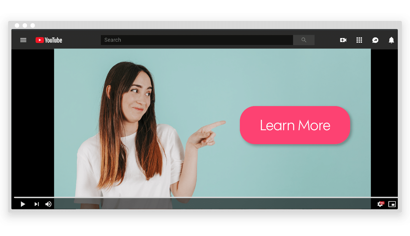
Pro tip: Use a visual element to direct the viewer toward your call to action. Have the speaker actually point in the direction of the form or button, or use an animated arrow to indicate the physical space where the audience needs to look at to perform the desired action.
How do I put a video on my landing page?
Now that you’ve gone through all the effort of researching, strategizing, and actually producing a killer landing page video, the only thing left to do is to stick it on the actual page. The process is pretty straightforward, but here are some steps that you should follow.
Choose a video player
You have a lot of options for how to embed the video onto your landing page; some are free, some more technical than others. Your needs will determine which service you use, but we highly suggest using one of the major video players. Services like YouTube, Vimeo, and Wistia are designed to stream video flawlessly on virtually every device and situation, as opposed to the video player that comes in a CMS like WordPress.
If you’re not sure, YouTube is a great starting point. You know it will work great on any device, and you can also rack up views for your channel.
If you’re looking for something more advanced, you might consider Wistia. It offers free and paid solutions, and it has lots of advanced marketing features like analytics, marketing automation, and integrations with your existing tools.
Above the fold
Make sure your video is embedded on your landing page above the fold—that means the video is completely visible without the user having to scroll down at all. This can be tricky on mobile, so make sure to preview your landing page on a mobile device prior to publishing.
Bonus points if you can also get your form or CTA button above the fold as well.
Should the video play automatically?
The question of whether your video landing page should autoplay or not is a hotly contested topic in digital marketing. Some think it helps get to the pain points of your prospects (and your company’s value proposition) faster, others think it can potentially annoy your target audience.
There are benefits and drawbacks to both, and the only true way to know which is better for your business would be to put each option through an A/B testing sequence, which requires either software or some serious elbow grease to sort out. If you’re not sure, we feel the risk of possibly annoying your prospect likely outweighs the potential benefit.
Bring it all together
The purpose of using a video on your landing pages is not the video itself, but rather increasing the conversion rate of the page. In that sense, the video must work in cohesion with the rest of the elements on the page, namely the headline, the form and/or CTA button, and description.
Unbounce has some great thoughts on the layout of your landing page. The actual style of the page is up to you and should fit your brand, but it’s really important to follow the basic outline of a high-performing landing page.
You made it through our exhaustive guide to video landing pages! You now have all the information you need to get out there and start increasing the conversion rates of your splash pages with video.
We know video production can be tough, especially if you’re just getting started. Our video template library can make getting over that hump even easier. Choose from different industries, or just search by topic and find a template that suits your needs. There is something for everyone, and a constantly expanding library of more than 15 million high-quality video clips to choose from. Get started for free today!
[banner id=11706]
