YouTube Banner Size, Dimensions, and Best Practices Guide
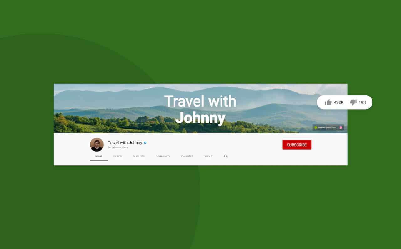
If you are looking to draw more attention to your YouTube channel, you are going to want to have all your visual assets optimized. One of your first action items should be to make the most of your YouTube banner size, design, and format.
Scrolling through YouTube channels, you have probably noticed that all YouTube channels have a large rectangular photo that resembles a cover photo on Facebook. This banner YouTube element—also known as YouTube channel art is a key factor in how much attention and subscribers your channel receives.
A YouTube banner (commonly referred to as channel art or a background image) is a powerful way to instantly capture viewers’ attention and communicate your brand visually.
This article will provide a complete YouTube banner size and YouTube banner guidelines guide to help your channel grow.
What is a YouTube Banner?
A YouTube banner is the large banner image that sits at the top of a YouTube channel page. It is the first thing visitors see and provides a quick preview of your channel, helping viewers understand what to expect from your content through visual branding.
Think of it as your book cover. A well-designed banner YouTube creators use can strongly influence whether visitors browse your channel, watch more content, and subscribe. The YouTube channel banner size often requires adjustments due to specific YouTube banner size and dimension requirements.
Paying close attention to these details helps ensure your YouTube channel art displays correctly across devices. At the same time, your YouTube banner ideas should clearly communicate your brand’s visual language, messaging, and personality to give your channel a polished, professional finish.
NEW Insight: With mobile-first browsing dominating YouTube consumption, many creators ask, what size should I make my YouTube banner? Your banner design strategy must prioritize how the YouTube banner size for phone appears on smartphones and tablets—not just the YouTube banner size desktop view.
Why Your YouTube Banner Matters More Than Ever
In small business marketing, first impressions are everything! In society, we often say, “Don’t judge a book by its cover,” but in today’s visual marketing world, that’s just lousy advice. Today, your social media visual presentation—especially your YouTube banner—is like the cover of your book, and it’s imperative to use visual branding to catch your audience.
In fact, studies show consistent visual brand messaging across media channels increases revenue up to 23%. So, having a cool banner YouTube creators use, such as well-designed YouTube channel art, that reflects your brand’s voice, can communicate what your brand is about and critical information about your channel.
Furthermore, not only does YouTube channel art play a critical role in highlighting the features of your brand, but it also provides a key opportunity to increase engagement with strategic placements of CTAs (Calls to Action) and a connection to other brand social media channels through your YouTube banner.
Update: With YouTube’s algorithm increasingly favoring channels with strong visual branding consistency, optimizing your YouTube banner size and following current YouTube banner guidelines means your banner now plays a more significant role in overall channel performance and discoverability.
Understanding YouTube Banner Aspect Ratios
The standard aspect ratio for YouTube is the widescreen 16:9, and bearing in mind that you have correctly placed critical brand information within the YouTube banner safe area, your YouTube banner will appear correctly across multiple devices based on the correct YouTube banner size and YT banner size.
If your image has a different aspect ratio, you might find you end up with letterboxes (black bars) or distorted images when you upload. It’s a great practice to familiarize yourself with aspect ratio and how to change a YouTube banner, understand what is the dimensions of a YouTube banner, and format your images properly according to YouTube banner guidelines. Additionally, on a side note, when you upload videos to your YouTube channel, it’s also essential to understand the aspect ratio as well.
YouTube Banner Dimensions
By now, you have an idea of what a channel banner (YouTube channel art or YouTube banner) is and that there are different sizes to be aware of, and the importance of understanding each margin size in your channel art.
You need to know a few key YouTube banner dimensions, YouTube banner size, and YouTube banner guidelines to optimize your banner for every viewing platform.
Official Specifications:
- Recommended Size: 2560 x 1440 pixels
- Minimum Size: 2048 x 1152 pixels
- Safe Area: 1546 x 423 pixels (center area visible on all devices)
- Maximum File Size: 6MB
- Aspect Ratio: 16:9
- File Formats: JPG, PNG, BMP, or GIF (non-animated)
These specifications answer common questions such as what the dimensions of a YouTube banner are, what is the pixel size for a YouTube banner is, and what size I should make my YouTube banner.
The three main margin areas to be aware of to ensure your content is showing up correctly for your YouTube banner size for phone, YouTube banner size desktop, and other devices are as follows:
Understanding Device-Specific Display Areas
YouTube recommends 2560 x 1440 pixels as the ideal dimension or resolution for banners. However, when creating a banner, you need to keep in mind the different “viewing areas” above that will optimize the viewing experience across multiple devices based on YouTube banner guidelines. Let’s take a look at each one more specifically.
Device Display Breakdown:
- TV Screens: Full banner (2560 x 1440 pixels) is visible
- Desktop: 2560 x 423 pixels visible
- Tablet: 1855 x 423 pixels visible
- Mobile: 1546 x 423 pixels visible (this is your safe area)
Mobile-First Priority: With over 60% of YouTube watch time happening on mobile devices, design your banner with the mobile view (1546 x 423 pixels) as your primary focus.
The Critical Safe Area
Imagine you designed and uploaded your YouTube banner or YouTube channel art on your desktop, and it looks perfect, but then when you open your YouTube channel on your mobile device, there are critical elements missing, like your channel name or your logo.
When this happens, it is because your YouTube channel art gets cropped depending on the viewing device on which it’s displayed. So while the high resolution of a 2560 x 1440 YouTube banner image ensures a quality viewing experience on televisions, your channel will look different on a YouTube banner size desktop and a YouTube banner size for phone, depending on where features are within the margins.
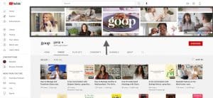
This is where the YouTube “Safe Area” comes to play. The safe area size shows you the part of your channel art banner that is viewable on all devices. You can see the designated safe areas below.
The safe area is the essential part of your channel banner. The safe area on your YouTube channel banner is where you should place all the critical information for your brand, like your logo and channel name.
This includes any CTA you don’t want to be lost when your channel is viewed on a mobile device. Additionally, the safe area can help with branding your channel, which we discuss further in this article.
Now that you understand that your YouTube banner for all devices displays differently across various screens, let’s take a look at the YouTube banner size and dimensions below:
Banner Display Specifications by Device
Banners are generally static images, referred to as “channel art” or “background images.” The YouTube channel banner image is divided into specific margin sizes to reflect viewing across various devices, like computers and mobile phones.
Typically, the entire image is referred to as the channel art, banner, YouTube creators use, or YouTube background image size. When viewed on television, the background image is the margin area that includes all the visual messaging in the broader areas outside the “safe area” (discussed further below).
The “safe area” is the margins in the center of the image and is often referred to as the “banner header or header image.” This safe area includes all the visual messaging seen on computers and mobile devices. Further down in the article, we break it down.
Choosing the Right Images for Your YouTube Banner
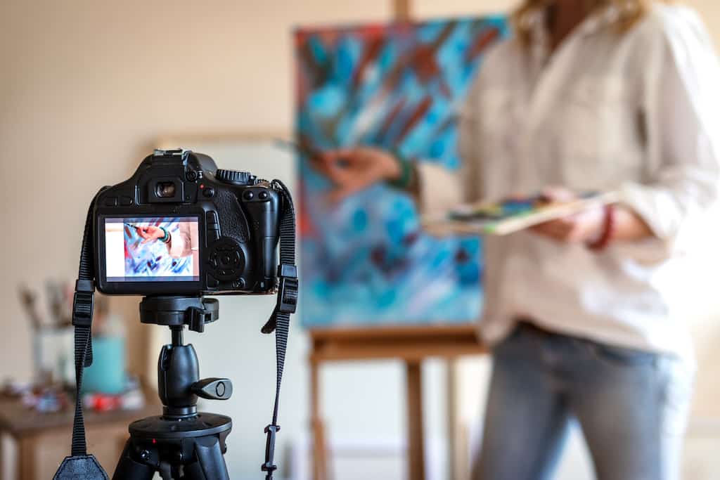
Because images are potent motivators, they encourage viewers to engage with content. In addition, images help form associations with your brand, and choosing the right image for your banner doesn’t have to be challenging.
Creating an aesthetic YouTube banner is not difficult with the vast resources online, like Getty Images and iStock, which provide quality images of every sort. So, before we go into various YouTube channel art sizes and YouTube banner dimensions, let’s start with choosing the most appropriate channel art images for your YouTube banner ideas.
Image Trends:
- High-Resolution Photography: Clean, professional photos that scale well across devices
- Minimalist Design: Simple layouts with plenty of white space
- Bold Typography: Large, readable fonts that work on small screens
- Dynamic Elements: Subtle animations or gradient overlays (while staying within file limits)
Brand Messaging Through Imagery
When scrolling for that perfect image that reflects your brand’s personality, an important question to keep in mind is what messaging or stories you want to communicate about your brand. What image will reflect your brand’s personality and work well with your messaging? In addition, how does the image look with the primary messaging focused on the safe area banner?
Your YouTube channel art template needs to be consistent in style, design, and even in your brand’s colors in general. For example, if you choose a black and white image as your channel art for the YouTube banner and your logo is green, will that combination reflect your brand’s visual language?
Starting with those questions will help you discover what type of image will help engage your viewers further into your content through effective YouTube banner ideas.
Image Optimization and Formatting
It is not uncommon to resize an image to achieve the perfect visual messaging for channel art. Understanding the perspectives of all the margin sizes that you need to make sure your channel art is viewable across different devices will help you resize your image according to the YouTube specifications.
Sometimes it’s just a matter of a simple ratio adjustment or even cropping an image that will go a long way in highlighting the essential elements in your banner that you want to stand out.
For example, suppose you wish to highlight a portrait in your banner. In that case, your background in the broader area surrounding the portrait probably won’t contain images of a lot of other people. With an easy image cropping tool, you can easily crop out any unwanted elements (like other people) in your image.
NEW Tip: Use AI-powered design tools to automatically optimize your images for different screen sizes while maintaining visual quality and brand consistency.
Maintaining Visual Consistency
Some YouTube channel creators pay close attention to the header image dimensions within the “safe area” (discussed further down) but forget to ensure that the background image is consistent with the brand’s personality.
The broader area extending outside the banner image safe area is commonly referred to as the YouTube background wallpaper. It is important to be consistent with your brand’s visual language. So, when you add colors, logos, or other visual elements in your safe area, they should be in the same theme and style as the background in your image.
So, consistency is crucial whether you want a Fortnite banner for your YouTube gaming channel or a black and white background for an aesthetic YouTube banner. Additionally, it’s easy to design photos with your brand’s visual language, like colors and logos, with online tools and then effortlessly trim to the required YouTube banner size, YouTube banner dimensions, and best banner size for YouTube with an online image resizer.
The key is to make sure your images, text styles, and overall visual language match throughout your YouTube channel art.
Using Templates vs. Custom Design
In addition to using high-quality images and creating your YouTube channel art template from scratch, many banner templates are available online. Typically, they come preformatted with various imaging.
Additionally, you can usually choose from a large variety of themes and colours, like Poster My Wall and Fotor. However, the only restriction for some of these templates is that you often lose the ability to customize your look & feel in the images. Also, you might need to reformat the YouTube banner size, YT banner size, or aspect ratio to follow YouTube banner guidelines.
Template Evolution: Modern design platforms now offer AI-assisted customization that maintains template structure while allowing for deeper brand personalization and automatic mobile optimization for YouTube banner size for phone and YouTube banner size desktop.
How to Update Your YouTube Banner
Sometimes it’s necessary to make changes to your channel as it grows. Whether you want to change your YouTube background image, update your YouTube banner, or add some creative, easy border designs to an existing banner, making those changes is simple.
YouTube Studio has been the home for YouTube creators since 2005, but in 2019, it received an overhaul in design to adapt to Google’s user interface. YouTube added many options to manage and grow your channel.
Uploading channel art for YouTube, updating your banner, or adjusting your YouTube banner size from your mobile device or desktop is effortless as a result.
Update Process:
- Go to YouTube Studio
- Select “Customization” from the left menu
- Click on the “Branding” tab
- Under “Banner image,” click “Upload”
- Select your 2560 x 1440 pixel image
- Use the preview tool to see how it appears across devices
- Adjust positioning if needed
- Click “Publish” to save changes
You can access the edit channel options with the mobile apps by tapping on your “profile picture” and then “your channel.” It is crucial to ensure your banners are correctly formatted according to the YouTube specifications and that your essential information is in the safe area we described above.
If you find that your banners need editing, you can use any image editor to customize your banner to ensure it’s viewed correctly on multiple viewing devices.
NEW Feature: YouTube now provides real-time preview across all device types during the upload process, making it easier to ensure your banner looks perfect everywhere.
The Importance of Visual Branding
Considering the number of users on YouTube today, it’s understandable why small businesses turn to YouTube to expand their audience and reach. However, even if you have a YouTube channel, crafting your brand identity is essential so that your visual content reflects your brand’s personality.
Therefore, having a consistent look and feel across all your visual marketing channels, whether it’s your YouTube channel, blog, or Instagram, is not only professional but critical.
Studies show that, on average, it takes at least 5 to 7 impressions for people to remember your brand, and 90% of customers expect a brand’s visual marketing to be similar across all devices and platforms.
Branding Insight: With AI-generated content becoming more prevalent, maintaining authentic and consistent human branding elements in your banner helps differentiate your channel and build trust with viewers.
A tip for maintaining consistency in your video creation so that your video content has the same look and feel as your banner is to use an online video maker for your content. This way, you can ensure your videos have the same theme by adding the same color, design, and fonts that coincide with your YouTube channel art.
Most successful YouTube channels have clear brand messaging that promotes consistent visual language in their graphics and content. Your banner should also reflect the same messaging, look, and feel your brand has in any YouTube intros or channel trailers.
Essential Design Elements for Your YouTube Banner
Many factors contribute to a brand’s identity, and your YouTube channel art is a great way to promote a brand’s personality. It is best to create graphics with the recommended design and visual identity that reflect your brand’s identity. Here, we will look at a few essential features to keep in mind in your visual marketing strategy.
High-Quality Images and Professional Appearance
You can use any image for your YouTube channel art and add your profile pic and logo. Remember that your YouTube channel banner is the viewer’s first impression, so using high-quality images for your YouTube banner image size is imperative.
Additionally, having your banner formatted correctly according to the proper ratio and size is critical. Consider creating your banner as another opportunity to brand your small business or channel and increase your visibility online. You want your brand to appear professional and well-polished to viewers to get them to stop scrolling, so high-quality images are a must.
Quality Standards:
- Minimum 300 DPI for crisp display across all devices
- Sharp focus with no pixelation when viewed on large screens
- Proper lighting that works well on both dark and light mode interfaces
- Color accuracy that remains consistent across different devices and browsers
In addition to branding your YouTube channel with a great banner, another important thing to keep in mind is your thumbnail. You want your YouTube thumbnail to reflect the essence of your brand as well. Creating a good YouTube thumbnail is easy with an excellent online thumbnail maker to ensure consistent branding.
Typography and Font Consistency
Using the correct banner font across all your video and graphic designs will contribute to your channel’s identity. Adding creative fonts and styles to your banner and keeping your color palette simple is a great way to provide branding consistency across your sharing channels.
In addition, it’s relatively simple to take any image, add customized text to your banner image, and even add the same text style to your videos to ensure the same look and feel is present in all your content assets.
Typography Trends:
- Bold, readable fonts that work well on small mobile screens
- Minimal text with maximum impact
- High contrast between text and background for accessibility
- Consistent font families across all channel elements
Logo Placement and Branding
Additionally, adding your logo to your banner is essential. The designated YouTube banner safe area of your banner is the perfect place to highlight your brand’s logo and is part of communicating a consistent brand language by placing your logo in all your graphic design, videos, and social media channels.
Strategic Logo Placement:
- Always within the safe area (1546 x 423 pixels)
- High contrast against the background
- Appropriate size – visible but not overwhelming
- Consistent positioning across all your marketing materials
Design Tips and Best Practices for
Among the many creative options or tips and tricks you might find online, we have singled out the most important and highlighted the following for a quick guide.
Safe Area Design Priority
The most important factor to keep in mind when designing your channel art is that your critical brand information needs to be within the safe area. However, that said, it’s easy to focus on that tiny rectangle in the middle and inadvertently ignore the rest.
While you want to make sure your banner is viewable across all devices, you also need to ensure it looks great on the larger screens. This means we don’t want to neglect the area outside the designated “safe area.”
Safe Area Strategy:
- Mobile-first design with safe area as primary focus
- Scalable elements that look good when cropped
- Strategic use of the full canvas for TV and desktop viewing
- Testing across devices before publishing
Social Media Integration
Users can add a minimum of one and a maximum of five social media links on their banner. When you view a YouTube channel’s banner, you will notice that there is a grey overlay in the bottom right corner that has the social links along with the channel icon. It’s helpful to remember this when creating your channel art, so you don’t place critical information in those areas.
When you add social media links on YouTube Banners, it promotes users to connect with you on all platforms, which increases brand awareness and drives engagement. Placing your social links in your banner makes them easy to spot, but you don’t want them to cover any vital information or design elements in the channel art.
NEW Integration Features:
- Cross-platform consistency is now tracked by YouTube’s algorithm
- Smart link optimization for better click-through rates
- Analytics integration for tracking social media traffic from your banner
Call-to-Action (CTA) Implementation
A call-to-action, otherwise known as CTA, is an interactive element that appears on your channel and YouTube ads to help with lead generation and drive clicks to your website or solicit subscribers. This is an effective way to build your brand.
The banner is the first thing users see when they open your YouTube channel and is considered prime marketing real estate for your channel. This makes it the perfect place for a call-to-action (CTA) or links to your other social media accounts.
Effective CTA Strategies:
- Clear, actionable language (“Subscribe for weekly tips”)
- Upload schedules (“New videos every Tuesday”)
- Value propositions (“Learn [skill] in 10 minutes”)
- Seasonal updates for current campaigns or events
Popular YouTube Banner Layout Styles for
There are so many ways to highlight essential information on your YouTube channel banner that the possibilities seem endless. So we decided to provide a quick overview of some of the common layouts YouTube channel creators have successfully used to brand content.
1. Minimalist Layout
NEW Trend: This clean, simple approach focuses on essential elements only, making it perfect for mobile viewing and professional channels.
Key features:
- Lots of white space
- Single focal point (logo or tagline)
- High contrast colors
- Maximum readability across all devices

2. Collage Style
This banner style is quite common and provides an array of options for creativity and diversity. It’s simply what its name reflects, a collage. You can combine several images to make a brand collage that highlights key elements of your brand and arrange them in different creative ways that line up with the margin areas needed for proper formatting. For example, a real estate agency might place images of different listings to reflect types of properties for rent or sale.
Collage Evolution:
- Mobile-optimized layouts with larger, fewer elements
- AI-assisted composition for better visual balance
- Dynamic elements that change seasonally

3. Centered Layout
This banner style is primarily used to highlight text in your banner or particular elements that reflect your brand in the center. For example, to make your brand name stand out, you would center the text in a creative font style across the YouTube Banner safe area.

4. Asymmetrical Layout
The asymmetrical layout is often used to reflect a more relaxed or fun style. Placing text, images, and key brand elements throughout the banner asymmetrically communicates an upbeat, creative tone. For example, a baker who offers diverse baked confections might bring delicious images to life through the fun use of color.
Asymmetrical Trends:
- Dynamic balance that works on all screen sizes
- Strategic negative space for mobile readability
- Cohesive color schemes that unify disparate elements

5. Creator-Focused Layout
This style and layout bring the channel’s creator into focus on the banner and highlight the profile pic or other key images of the YouTube creator in the safe area. This style usually features a professionally posed picture of the content creator as the main image focus. Often, the background image will not contain any elements that distract from the creator’s picture.
Personal Branding Focus:
- Authentic, professional photography that builds trust
- Consistent personal brand colors
- Clear value proposition about what the creator offers

6. Logo-Centric Layout
The logo layout is self-explanatory. The primary focus of the banner is the brand’s logo. The centered tile and logo layouts are often combined to drive a clear and powerful brand message. For example, high contrast colors can be used to bring out the logo of a small business as well as center it in the banner.

7. Tagline-Focused Layout
Like the logo layout, this style places the focus on the brand’s tagline. Often this is accompanied by the logo because many brands have their tagline connected to their logo, but not always. For example, the well-known SEO company ahrefs is centered in the banner with the tagline “grow your traffic.”

8. Content-Theme Layout
This layout typically uses an image that reflects what your channel is about. For example, if you have a health and fitness channel, this image might be a collage of fitness pictures that highlight an active lifestyle and health. The idea behind this layout is to communicate what your business is about without using a lot of text.
Content-Theme Evolution:
- Niche-specific visual languages that immediately communicate your content type
- Seasonal adaptability for ongoing relevance
- AI-generated backgrounds that complement your content perfectly

Advanced Banner Strategies
Regular Updates for Maximum Impact
Best Practice: Update your banner every 3-6 months to maintain freshness and reflect:
- New series or content focuses
- Seasonal themes and holidays
- Channel milestones and achievements
- Brand evolution or rebranding efforts
- Special events or collaborations
Analytics-Driven Design Decisions
NEW Approach: Use YouTube Analytics to inform your banner design:
- Track click-through rates on social media links
- Monitor subscriber growth after banner updates
- Analyze audience demographics to tailor visual appeal
- Test different designs with A/B testing approaches
Mobile Optimization Priority
Critical Focus: With mobile dominating YouTube consumption:
- Design mobile-first, then scale up
- Test readability on actual mobile devices
- Ensure tap-friendly social media link areas
- Consider vertical video consumption habits in your design
Maximizing Your Banner’s Potential with Promo.com
When you cover all the above topics and connect the dots to the larger picture, it’s easy to see how vital channel art for YouTube is to your small business or gaming YouTube channel.
As channel creators invest time into their YouTube channels and brand their channel art with their visual messaging and language, it becomes a unique opportunity to create greater online visibility and drive user engagement. To showcase consistency, many YouTubers use their channel art in promo videos – you can add a photo to a video easily with Promo.com.
The possibilities are almost limitless when choosing the perfect channel art with all the online resources. Additionally, it’s effortless to trim banners to the specific sizes necessary for proper viewing across various devices with online YouTube banner image size trimmers.
The most important thing to take away is to understand that visual branding and consistency are critical and will determine the success of your small business YouTube channel.
Promo.com Advantage:
- AI-powered design suggestions that optimize for current trends
- Automatic sizing for all YouTube specifications
- Brand consistency tools that sync across all your marketing materials
- Performance analytics to track your banner’s effectiveness
Your YouTube Banner Strategy
Creating an effective YouTube banner requires balancing artistic creativity with technical precision. Your banner must work seamlessly across an increasingly diverse range of devices while capturing your brand’s essence in a crowded digital landscape.
Key Takeaways:
- Mobile-first design is non-negotiable
- Consistent branding across all platforms builds trust and recognition
- Regular updates keep your channel fresh and engaging
- High-quality visuals reflect professionalism and attention to detail
- Strategic placement of elements within the safe area ensures visibility
Remember that your YouTube banner is often the first impression potential subscribers have of your channel. With increased competition and shorter attention spans, that first impression needs to be immediate, compelling, and professional.
Whether you’re a content creator, small business owner, or established brand, investing time in creating the perfect YouTube banner will pay dividends in subscriber growth, brand recognition, and overall channel success.
Choose from over 110M+ photos and videos or use a ready-made template. Brand and share in minutes.
FAQs
- What is the YT banner size?
The recommended YouTube standard banner size is 2560 x 1440 pixels. The size will make sure that your banner appears well on TVs, desktops, tablets, and cell phones.
- What’s the size of a YouTube banner?
The entire size of the YouTube banner is 2560 x 1440 pixels, and the safe area is centered at 1546 x 423 pixels, which is seen in all devices.
- What are the dimensions of a YouTube banner?
The dimensions of a YouTube banner are:
Full size: 2560 × 1440 pixels
Minimum size: 2048 × 1152 pixels
Safe area: 1546 × 423 pixels
These dimensions follow official YouTube banner guidelines.
- What is the pixel size for a YouTube banner?
The recommended pixel size for a YouTube banner is 2560 × 1440 pixels, with all essential text and logos placed within the safe area to avoid cropping.
- What is the YouTube banner size for phone?
On mobile devices, only the safe area (1546 × 423 pixels) of your YouTube banner is visible. This makes mobile-first design essential.
- What is the YouTube background image size?
The YouTube background image size refers to the full banner canvas of 2560 × 1440 pixels, which is fully visible on TV screens.
The Perfect YouTube Intro
Choose from over 110M+ photos and videos or use a ready-made template. Brand and share in minutes
About the author
KC Kinniburgh
KC Kinniburgh is a content manager at Promo. Her writing genre includes almost all aspects of the digital online industry, emphasizing the hi-tech sector. When she is not obsessing about proper punctuation or capitalization, she is learning about the E8 lattice or working out.

