Vital Design Elements for Successful eCommerce Stores
There are many aspects that influence people while they’re shopping online. Even though a product could be flawless, a poor user experience can destroy an online shopper’s desire to buy anything. Reaching a better conversion rate in an online store, therefore, demands substantial attention and effort from a business. Let’s talk about design elements for eCommerce stores that will enhance the shopper experience and make an eCommerce store more convenient (and converting) for visitors.
PWA creation, video content, AR-based functionality, product customizers, visible social proof, and personalization are amongst the trending UX/UI elements and approaches adopted by online stores in an effort to help leads slide through the sales funnel. In this piece, we’ll cover the major elements of UX and UI design that can help an online retail store succeed.
1. PWA Building
The statistics are pretty persuasive: mobile users are 5 times more likely to leave a website without finishing a purchase if the site isn’t mobile-friendly. Furthermore, more than half of the respondents will close a website that takes more than 3 seconds to load on their smartphones. Research also shows that a whopping 94% of first impressions of a site are linked with its design.
Several years ago, Google began promoting progressive web apps (PWAs), a solution to efficiently and relatively inexpensively resolve the issues stated above. Here are some significant advantages of the PWA technology worth noting:
- A PWA is still a website, but on mobile phones, it operates as a native app.
- A user can add a link shortcut of the PWA to the home screen without the need to spend precious space storage.
- PWAs have lightning-fast performance and loading speed.
- Their intuitive and extremely handy UX/UI was borrowed from classic mobile apps.
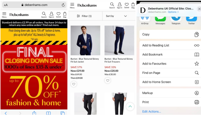
For instance, on the screenshot below, you can see Debenhams’s PWA as it is seen on a mobile screen. It brought about a 20% increase in conversions due to its clean and comprehensible design, fast speed, and ability to send push notifications that are unavailable for regular websites. Did you notice that the design and the UX/UI of the elements are very reminiscent of native applications?
2. Creating Product Videos
According to one of the latest surveys, 84% of respondents have been convinced to buy something after watching a video. And, while some brands underestimate video marketing, others leverage it by featuring videos wherever possible.
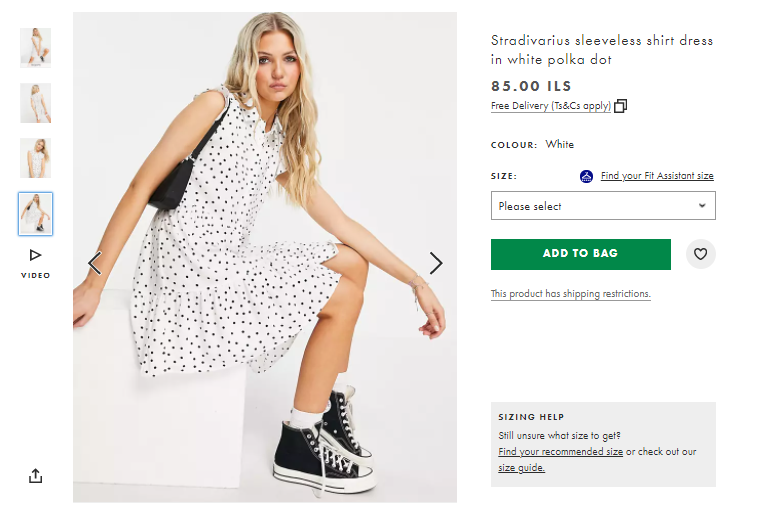
For instance, ASOS adds product videos to showcase how the clothes fit on the body and behave in motion. It’s far more conclusive for a prospect than just photos with the right posing. Note, that ASOS embeds such videos right into photo galleries so that these pieces of content are visible and reachable without the need to scroll.
There are loads of ideas when it comes to creating product videos:
- you can unbox it;
- show off how it functions;
- how to use it in varied ways;
- how it was invented, and so on.
Just stick to the concept of bringing more value to your customers around every product you offer, and the ideas for product videos will be abundant. Product videos are therefore a natural addition and design element for any eCommerce store.
3. Social Proof
There’s one thing that always compels people when they’re considering a new purchase, especially a costly one. It is how others evaluate this acquisition. The statistics say that for 95% of people, feedback from other buyers has an impact on purchasing decisions.
As testimonials really matter, brands tend to add as much social proof as possible. These areas are becoming crucial design elements for eCommerce stores. Try to give attention to both of the ones mentioned below.
Social Media Widgets
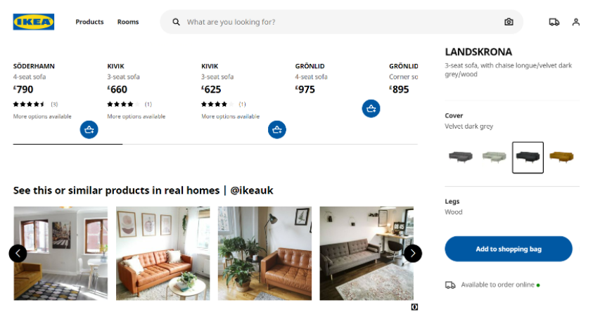
Note that such blocks appear right on the product pages and show a particular commodity in use. Take a look at the screen from Ikea’s website. Here we see how the sofa that someone is about to choose looks in different real interiors. This type of content is priceless!
It’s worth saying that attention to user-generated content builds a closer connection between customers and a company.
Product Reviews
Every huge online store has such functionality because people find testimonials far more credible than any promises from producers.
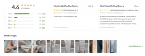
Have a look at the “Customer Reviews” part of the product page on the iHerb website. We can not only read all the feedback but also instantly estimate a product’s rating, see photos, and how useful any of the comments were for other visitors. Every single design element for this eCommerce store has its significant role. In order to get as many testimonials as possible, some companies attract their customers to post their testimonials by giving bonuses or discounts.
4. Product Customization
Clients are on the lookout for customization options and are even ready to pay more for having a kind of bespoke product. Various constructors are quite popular amongst footwear, apparel, and accessories brands. However, some interesting examples of product customizers can also be found on the websites of furniture makers, car manufacturers, and stationery producers.
Customization allows a person to create a unique product that fully fits their vision and requirements. Thus, it raises the probability of buying an item that otherwise would be unsuitable due to its color or décor.
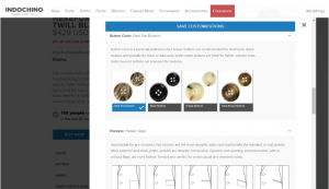
Take a look at how designers organized the constructor on the website of a Canadian menswear brand Indochino. Here a user can create an impeccable suit. About 17 customization options are available for the jackets, 14 for shirts, 4 for pants, and 3 for vests. All blocks have some explanations related to the style of clothing.
5. AR-Powered Try-On
Statista reported that 44% of consumers under the age of 40 used augmented reality to assist them during shopping in 2019. 47% of respondents of all ages claimed they would like to try it if given the opportunity. And that’s no wonder since AR helps us try on new sneakers or a dress, lipstick or mascara, or even an armchair no matter where we are.
Makeup and shoe brands are in the avant-garde when it comes to leveraging AR in eCommerce. For instance, the Try-On feature has already been embedded into the product pages of Estée Lauder, Sephora, Bare Minerals, NYX, YSL Beauty, Lancôme, Urban Decay, and other popular online shops.
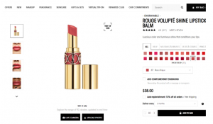
Let’s see the screenshot from the YSL website where you can put on lipsticks, mascaras, eyeliners, blushes, foundations, and other products. The “Virtual Try-On” option is even located right in the main menu. You can either use a live camera or a photo to explore shades and/or the overall effect of the product. See how stylishly, yet vividly the designers highlighted the feature? Black buttons and the square with the “Try It On” title grab one’s attention and invite shoppers to enjoy the experience.
6. Personalized Recommendations
All types of personalization auspiciously affect sales. And the data related to the matter is striking. For instance, 80% of consumers are more likely to opt for a brand with a personalized approach.
There are several popular ways to provide desirable personalization. One of them is making the “You may also like” block as targeted as possible.
As such, AI algorithms collect information about what a user searched for on the website, which goods remained in their shopping cart the last time, and which items they marked as “favorite”. The recommendations based on this data could be very precise.
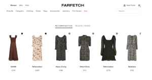
Take a look at the screenshot from Farfetch. As you see, the “Recommendation” block includes dresses similar to those that I added to my wish list on the website. Noteworthy, there are items that I haven’t seen here yet. The design here is clean and plain without any excessive information.
As more offerings match our tastes and preferences, the likelihood of buying soars. Also, Farfetch uses a super handy block “Complete the look”, which raises chances of cross-selling and up-selling.
To Sum Up
Design elements in eCommerce stores and overall UX/UI have a tremendous impact on how a person perceives the online store. Moreover, often these aspects predetermine vital decisions, i.e. whether to make a purchase or not. After being thoroughly examined and equipped with cutting-edge technologies, your online store will thrive in a competitive market full of demanding clients!


