What Visual Marketing Teaches Us About Customer Psychology
When it comes to the valuable currency of consumer attention, your brand isn’t only competing with other brands in the same niche. It is also competing with cat videos, viral challenges, how-to hacks, and much more.
Marketers have to enhance their visual marketing campaigns if they want to attract and hold the attention of their audiences. Customer psychology helps in understanding the ways that aspects like color, image, and aesthetics can be used to create effective campaigns.
Customer psychology also tells us a lot about the motivations behind consumer decisions. Studying people’s reactions to visual campaigns can show us how images, color, and font choices subconsciously affect the consumer’s decision to purchase. This guide will look at five visual marketing techniques that are rooted in psychology.
Let’s dive in!
What is customer psychology?
Customer psychology (or consumer psychology) is the study of buying patterns, behaviors, and people’s responses to products. It tells us why and how consumers react to certain products and advertisements. Marketers pay particular attention to consumer psychology as it helps them understand how best to promote their products.
While studies on consumer behavior began as early as the 1900s, it was not until the 1950s that marketing departments started taking them more seriously. As businesses shifted to a more consumer-centric mindset, marketers needed to understand customers and their motivations on a deeper level.
From the dominant colors on your website to the images you choose for your promotions, consumer psychology states that visual choices directly impact purchase decisions. For example, you will notice that the color red is often used to denote limited-time deals or subscribe buttons. Red is associated with urgency and aggression, and the use of the color on call to action (CTA) buttons draws your attention and makes you want to click it right away.
5 things visual marketing teaches us about consumer psychology
Visual marketing is one of the most effective forms of promoting products, inspiring brand loyalty, and driving engagement. It is easy to comprehend visual cues and you can deliver a lot of information without forcing your audience to read a wall of text. It’s also not just limited to images – visual marketing is present in everything from the color you choose for your website to the fonts you use.
In this section, we will look at what these elements can teach us about consumer psychology and how brands have used them to drive conversions and engagement.
1. Color psychology
The colors used on your website and email copy aren’t just there to look pretty. They make a real impact on the overall appeal of your offering. For example, a study found that changing the color of a CTA button from green to yellow led to a 14.5% rise in conversions. The reason? The contrast of yellow against a white page background made it easier to see. It was also easier on the eyes than the previous button.
Source: Nielsen Norman Group
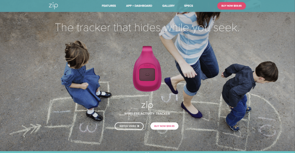
Similarly, another study reported that users of Fitbit’s website (image above) ignored many of its glitches due to the presence of the color blue on the site. It made them feel calm and was a factor in encouraging positive feedback despite the less-than-ideal user experience.
Color choices directly affect how people perceive your brand. There is no perfect science that describes the role of color in marketing, but marketers must understand how consumers react to particular colors to create campaigns that work for their business. The best way to do this is through market research and robust A/B testing at every stage.
2. Visuals drive impulse buys
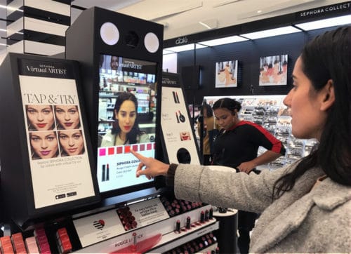
Impulse buys, both in-store and online, represent a significant chunk of all purchases. A study by Invesp estimates that impulse buys represent almost 40% of all the money spent in eCommerce stores. Not surprisingly, it’s even higher for physical stores because customers can see and touch the items they’re interested in. Eye-catching store displays help drive sales.
 Source: Perch Interactive
Aside from static (non-moving) displays, you can use interactive visual displays or digital signage inside your store to draw attention to your products. This approach is particularly useful for stores that carry a lot of products or products with different color or style options. There are numerous creative ways to use this type of technology in your visual marketing.
For example, when you walk into Sephora’s stores, you don’t even need to put on the products to see if they suit you. Instead, you can take a selfie using the camera built into the digital display, then swipe through different swatches to find a shade that looks great on your skin. It’s a lot safer and more hygienic than using lipstick or foundation samplers!
This approach has even been utilized by creative eCommerce retailers. For example, British eyewear retailer, Specsavers, has developed a creative online try-on app where customers can see how glasses look using their phone camera or webcam:
 Source: Irish Tech News
The takeaway? Get creative with visuals and technology to boost interest in your products and encourage impulse purchases.
3. Visual aesthetics are directly linked to emotions
Creating an emotional connection between the brand and the consumer is at the heart of all marketing storytelling.
Nike has always been at the fore of emotional marketing with its ad campaigns. It’s “You can’t stop us” ad spot was a brilliant example of how visuals can be a powerful tool to tap into consumers’ emotions. The ad featured some of the biggest names in the sports world, and addressed the need to make the world a better place for all in the face of the COVID-19 crisis.
 Source: YouTube
The video made such an impact that it had received more than 59 million views as of January 2021. Now, imagine if the video didn’t feature the world’s greatest athletes or address contemporary issues with striking imagery. It’s safe to assume that it wouldn’t have racked up the same number of views or been shared by millions of people around the world.
Consumers respond strongly to visual cues, whether they’re images on your site or video campaigns in your marketing emails and on your social media channels. Visuals can help you connect emotionally with your customers, and this connection will help drive sales and build long-term consumer loyalty.
4. The decoy effect
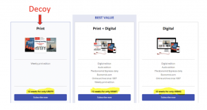
Visuals are not just pleasing to the eye. They also help consumers compare products easily. Marketers take advantage of this customer tendency through the “decoy effect”, placing three products side-by-side and including one “decoy” product that is added to make the expensive product look more desirable:
Source: Humanhow
In the example above, the marketer chose to feature a print subscription to The Economist, its corresponding digital version, and a bundle that includes both. The digital-only edition costs just $62, while the bundle costs $87. If those two are the only featured products, a customer is more likely to buy the $62 product simply because it’s cheaper. However, when you introduce the $70 print-only offer, the $87 bundle suddenly looks like a steal.
By combining both products and using an image that highlights how much more the customer will be getting for just a few dollars more, it primes potential buyers to believe that they’re getting a much better deal.
The marketer in this example has gone a step further by highlighting the bundle and labelling it as “Best Value”. A customer who’s always looking for the best deal available will likely gravitate towards the $87 bundle because it’s tagged as such.
5. Text font and color psychology
Visual marketing also includes the way you lay out your text. From the logo on your marketing collaterals to the font you use in your written content, each aspect of typography has a foundation in consumer psychology.
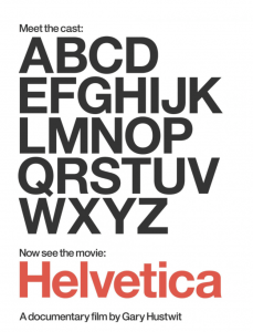
Fonts with serifs (the small extra strokes on the ends of letters in some fonts) such as Times New Roman, signify tradition, while some sans serif fonts like Helvetica signal stability. Many of the world’s top companies, including Subway, Target, Lufthansa, and Fendi, use Helvetica in their logos and marketing material. In fact, Helvetica is so ubiquitous that there’s even a documentary film about it.
 Source: Posterhouse
The color of your text also makes a difference in both readability and brand recall. For the longest time, IBM was known for its iconic logo that consisted of big block letters in blue, and even after numerous changes to its marketing approach, it’s still known colloquially as Big Blue. Google, on the other hand, is known for using rainbow colors in its logo.
Understanding the importance of using the right font and text color will help you build a brand that communicates with consumers effectively. If you still haven’t decided on a text font and color for your brand, you can start by carrying out some A/B testing on different color and font combinations. Do not underestimate the importance of choosing the right font and color of text.
The bottom line
Many marketing practices that have become commonplace, from the red CTA button to the use of a decoy product, have their roots in customer psychology. However, to understand how and why visual marketing affects the consumer, we must delve into the psychological factors behind customer responses. Understanding these factors will help us target our audience and create more effective marketing campaigns.
From utilizing color and text psychology to driving impulse buys through images, visual marketing has an incredibly powerful sway when it comes to purchasing decisions. By learning how great brands use a strong knowledge of customer psychology to drive conversions and increase engagement, you’ll be well placed to do the same.
Good luck!


